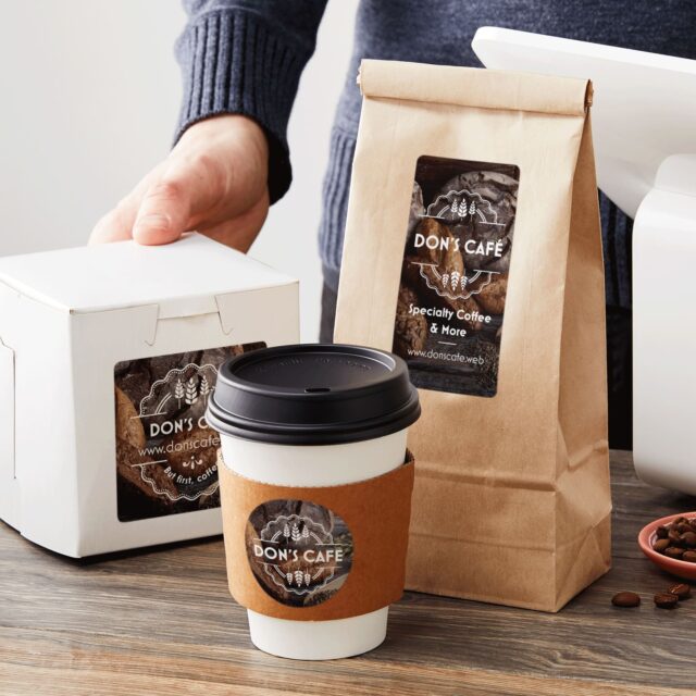
If you do some digging online, you’ll learn that a lot of professionals believe that there are various characteristics that could easily improve the goods’ appeal to consumers. For starters, the quality of the items is crucial, however, in order for you to sell your merchandise in the ever-growing competitive market, you must focus on the labels and packaging you choose as well.
But, since you might have never changed your product design before, you might be wondering – what are some of the best tips I could utilize for designing the perfect label? Fortunately for all people searching for an answer to this question, this article can help. Let’s take a closer look at the top 7 things you need to focus on:
Page Contents
1. Firstly, Ensure That You Feature Important Information
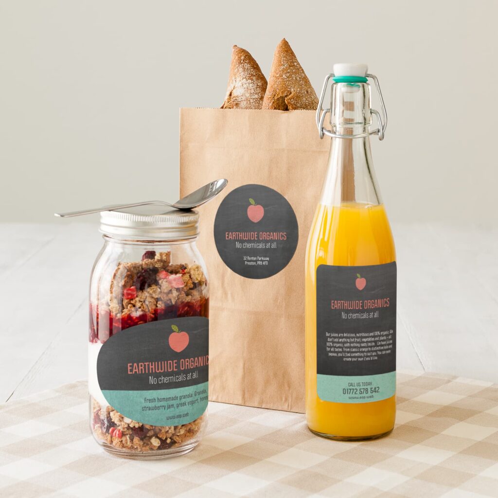
Before you do anything else from this list, take your notebook and write down all the essential information you’ll have to feature on the product label. Why do you do this first? Well, the space on it is going to be limited, and by knowing what you’ll have to feature, you’ll know how you could position all of the important things.
Some of the important info that you’ll need to feature on the front of the package includes the title of the piece, the logo or trademark name, the units of measure expressing the quantity, amount, or weight of the article, as well as a brief description. When it comes to the back place things such as the ingredients, the story behind the item, as well as a user’s manual – if needed.
2. It Must Be Readable
Once you begin designing, it is crucial to ensure that people can read the description properly and without hindrances, which implies that you’ll need to opt for proper font size and color. This means that you should utilize a font size that is big enough for all, including individuals that wear reading glasses.
Additionally, you should ensure that the color of the font has a nice contrast with the background. Generally, brighter colors can affect individuals to purchase, however, the hues you choose will mostly rely on the sort of product you offer and the style of the brand, hence, you’ll have to match everything properly and well.
3. Consider Your Packaging Choice
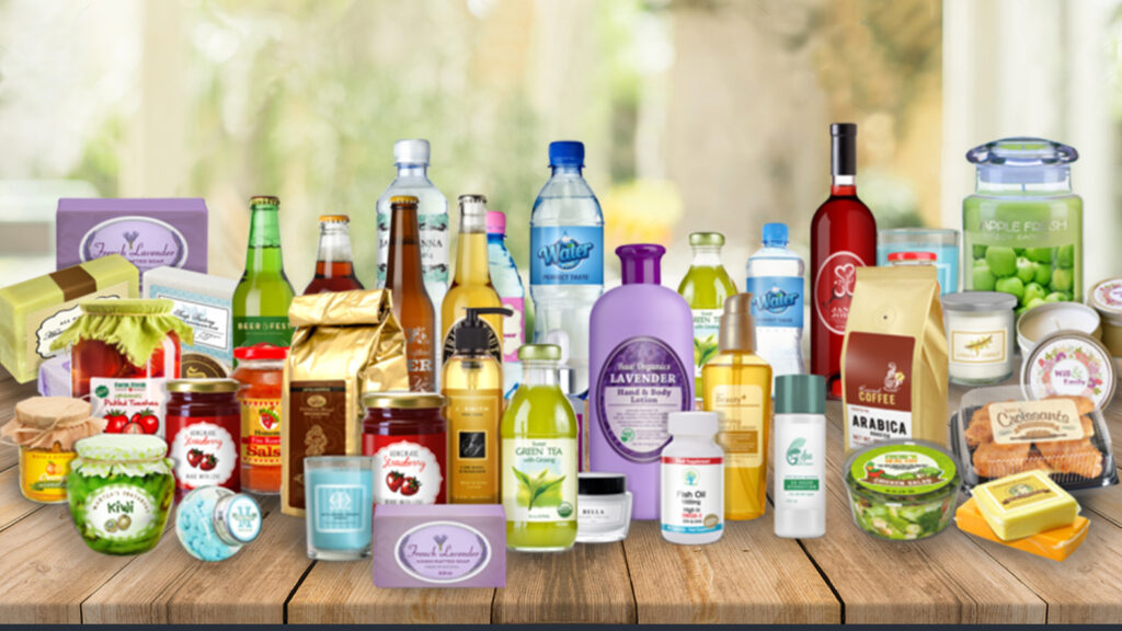
The shape, sort, and size of the packaging you opted for will also determine what you could do. For instance, if you offer small containers of coffee, the label has to be smaller. Since it is small, it will need to have a good design in order to stand out, however, you cannot actually feature too much information since it won’t be readable.
Each item has different packaging – a bottle of mayo will need a label completely different than a box of cookies – hence, when planning, you must keep the packaging in mind as well. This means that you should consider the item’s size, shape, and where it’ll be placed. Doing so will make it easier for you to understand what you could work with and what you might need to skip.
4. You Must Leave Blank Areas
‘White space’ is basically a term that describes the empty area between various aspects of a design. This is not only used when designing, instead, but you can also see it on business cards and website too. The blank space guarantees that the description does not become too messy and uncomfortable to the eyes.
According to the professionals from labels123.net that specialize in selling high-quality labels, you must leave enough blank areas between each component of the design since this will ensure that your clients focus on reading one thing at a time. This will also help separate relevant information from the visual aspects.
5. It Must Be Decorated
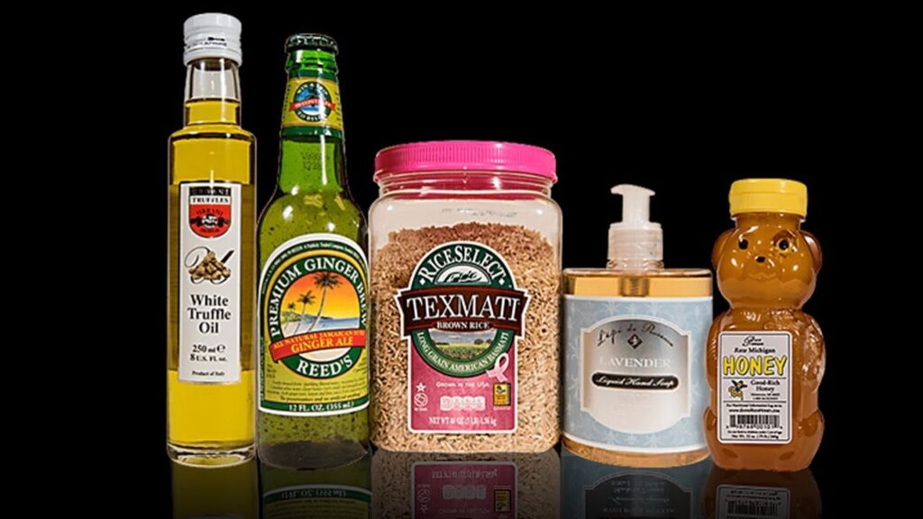
If you do not include any decorative elements on your label, it will surely be quite unattractive and basic. There are various things that you can opt for, however, it will mostly depend on the item you are selling, as well as the story you want to tell your current and potential customers.
For instance, if you’re selling different juices, you can opt for using quirky and abstract colors, each representing the flavor of each juice. Additionally, you could also choose to implement illustrations such as oranges or strawberries that will further tell the story of your product and brand. Doing so will make the item stand out from the crowd, which implies that you could increase your revenue.
6. There is no Need For Traditional Shapes
Just because you are selling a round box of cookies, it does not mean that you need to choose a round label for it. Why should you choose to do this? Well, it is one of the easiest and simplest ways that you could make your product stand out when seeing on a shelf in a store.
Of course, if it is impossible for you to use a quirky shape, you can always think of something creative. For example, if you need to have a rectangular label, you can choose to make it stand out from the crowd by using various colors that will make it seem like it has an irregular shape. In the world of graphic design, everything is possible, hence, ensure that you reap all the benefits.
7. Always Complement The Packaging You Opted For
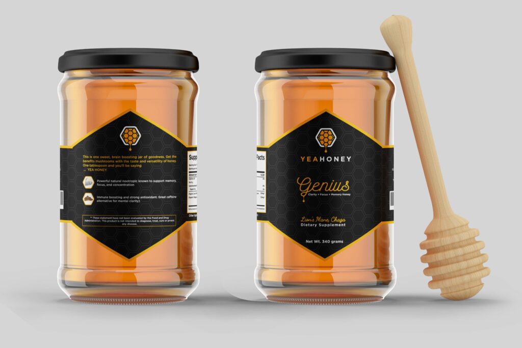
Your brand might be focusing on using Eco-friendly materials, hence, if the packaging you chose is made from materials that are environmentally-friendly, you must ensure that you compliment that on the label you design. This means that you should clearly state that your brand is Eco-friendly.
Also, if you, for instance, donate some of your profits from a product to a charity of your choosing, it is crucial that you mention it as well. This will ensure that people learn more about your entire brand story, which means that they might opt for purchasing your product, instead of a different one.
Conclusion
Designing a label for your product is never an easy process, nonetheless, it is quite important since it can help you with improving your sales. And, if you choose to follow some or all of the tips mentioned in the article above, you can make the entire design process easier, less time-consuming, and more importantly, less stressful for everyone involved.
Hence, now that you are aware of all the things you might need to focus on, you should really not lose any more of your precious time. Instead, return to the beginning of the list above, and start working on the first tips we mentioned – which is writing down all the important information you want to feature on your packaging.


